Demystifying Response Plans5 min read
Humanitarian crises are complex. The causes are complex – conflict, economic deterioration, and natural disasters, to name only a few. And then there is displacement – when people get displaced in their own country, or across an international border. Humanitarian responses need to meet the complex needs that arise from these situations. But how we coordinate those responses can also be complex.
Humanitarian actors get together to come up with inter-agency plans that outline the repsonse: what activities will be implemented, what funding is needed, how things will be monitored, and so on. But often one context can have different types of response at the same time.
For example, Afghanistan already had a Humanitarian Response Plan in 2021 that sought to respond to the acute food insecurity and humanitarian needs that were pre-existing and driven by “decades of conflict, recurrent natural disasters, lack of recovery from past crises and the added health and socio-economic strain of the COVID-19 pandemic”. And then, with the leadership transition and the implications on services, a new Flash Appeal was needed. The new crisis in Afghanistan has also led to a new Refugee Response Plan being necessary to respond to the new outflows of refugees from Afghanistan to neighbouring countries (such as Iran, Pakistan, Tajikistan, Turkmenistan, and Uzbekistan).
Types of Response Plans
To clarify what we are talking about, the definitions of the different types of plan (or classifications we’ve chosen to use in this story) are presented below.
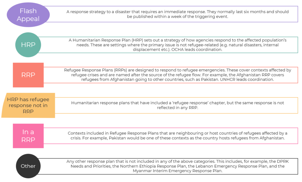
Each type of response plan relates to a different type of crisis. Some countries might only be in one category. Others might have a mix of two or three different types of response plan. This story attempts to map different contexts across these six different categories, and thus demystify what’s going on with response plans in 2021 – but also at the same time show in a single diagram how utterly confusing it can be as well.
2021 Map of Response Plans
What you’ll find below is a map (or chart?) showing which countries have which types of response plans. It wasn’t supposed to be a mix between a terrible piece of art faintly modeled on The Snail by Matisse and an attempt at a headache-inducing overly complex venn diagram, but it appears to have landed boldly and unapologetically in that space.
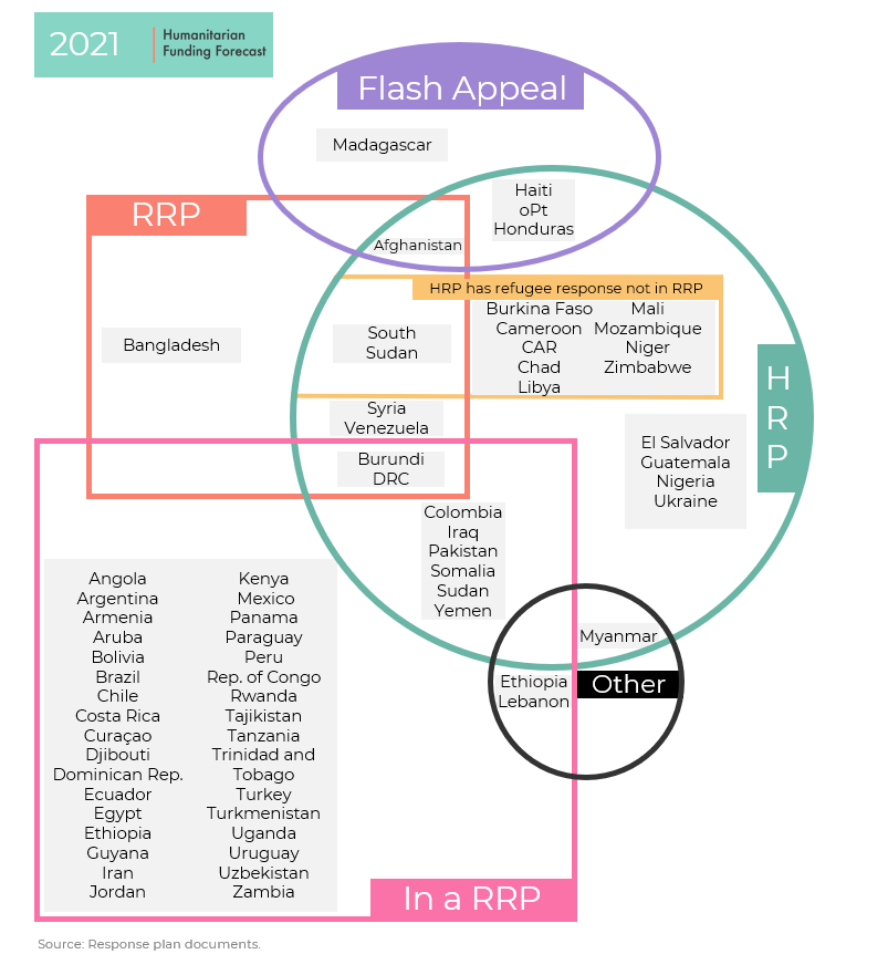
We’d love to hear your thoughts on what the map tells you about humanitarian crises and their coordination, but here are just a few of our initial thoughts.
Firstly, it would be a great reference for anyone starting out in humanitarian affairs to understand where each country is situated in the complex mess of humanitarian coordination. The map shows the similarities between contexts that might not be immediately obvious. Burkina Faso and Mozambique inhibit the same space, as do Haiti and Honduras. Does that also mean that contexts in each segment can learn from each other in terms of how they coordinate things?
Secondly, it shows precisely that – how complex humanitarian coordination and response planning is. In the map above there are 13 different segments where contexts live. This includes contexts that only have one response plan (for example Ukraine with its HRP), and contexts that have at least three responses going on, such as Burundi which is in RRPs, has an RRP itself, as well as a HRP. It tells us something about how complex contexts are, but also potentially about how unique they are.
Thirdly, it shows the massive overlap between refugee crises and other crises. Of the 29 HRPs in 2021 (remember those are the plans that are not primarily refugee-focused), only 8 of those contexts don’t have some element of a plan, or a plan itself, regarding refugees. Contexts often face intersecting simulatenous multiple crises – they don’t just get hit by lightning once, but multiple times.
Has the map changed in the last five years?
On the one hand – the shape of the map hasn’t changed. The flash appeal circle on the 2016 map has had to enlarge slightly to include a different segment (HRP, with refugee response included + Flash Appeal), and Iraq was included in a RRP as well as a HRP and Flash Appeal. But on the whole the same segments are being used.
It is interesting that the number of contexts included with (or included in) an inter-agency response plan has increased from 48 to 66. Fewer contexts only have just HRPs, more HRPs have a refugee response included in them, and more contexts are included in RRPs. In short, the refugee boxes in the map have got a lot busier.
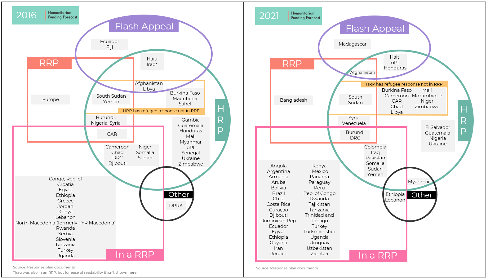
So what does this all mean? It definitely underscores the need for strong coordination in ‘mixed settings’ with both a refugee and non-refugee response. And it shows how the humanitarian universe is growing. But that’s just our initial take.
Like anything that resembles art (large prints of the map for your office or bedroom are available) it’s up to the audience to extrapolate meaning. What strikes you about the map? What does it mean for humanitarian response planning and coordination? Are we missing some crucial lessons here? Answers in the comments box below.
Methodology and Sources
Contexts were mapped using hum-insight.info, and then this was cross-referenced with a manual secondary data review of each response plan itself.
Note: Bangladesh is included as an “RRP” as the Joint Response Plan responds to the needs of the Rohingya refugees in Bangladesh. Unlike other RRPs, it isn’t the source of the refugee outflow.