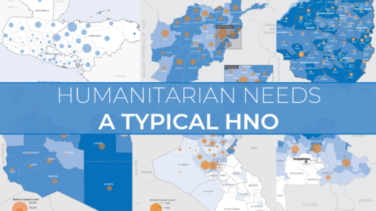
A Typical Humanitarian Response Plan (HRP)7 min read
The season of HNOs and HRPs is upon us. It’s that time of year where hundreds of people worldwide spend countless hours producing two documents for their context: the Humanitarian Needs Overview (HNO) and the Humanitarian Response Plan (HRP). 29 contexts produced these documents for 2021, and it’s likely a similar amount will be produced for 2022. But given that hundreds of these documents exist, it’s not immediately obvious what a “typical” HRP looks like.
This story looks at a “typical” HRP. We’ll do this by looking at what HRPs say about the amount of funding is required (the funding requirement). In particular, what does each sector typically ask for as a percentage of the whole funding required for the HRP?
We’ll be using the term “envelope” below. What we mean by that is the percentage of the overall funding requirement of the HRP needed for a certain sector. For example, the envelope for Food Security in Zimbabwe was 70% – in other words, of all the funding required for the Zimbabwe HRP, 70% was needed for Food Security. Whereas, the envelope for Child Protection was 1% in Zimbabwe – so of all the funding required for Zimbabwe, only 1% was needed for Child Protection.
The Typical HRP
The table below presents the average envelope for each humanitarian sector (in contexts where they are active). Food Security has the largest envelope by some distance: 36% vs. the next sector which is only on 9%. Food Security dominates the funding required, and ultimately (as we will see below) shapes the envelope for other sectors.
Then we have two mid tiers: an “upper-mid” tier of large humanitarian sectors, such as: Health, Nutrition and WASH which average between 6-8% for their envelopes. The “lower-mid” tier of sectors between 4-6% consist of Protection, and Early Recovery and Multi-Sector (though the latter two don’t appear in as many contexts as the others).
Lastly we have the lower tier: nine humanitarian sectors that have an envelope of less than 3% on average in the contexts where they are active. Some of these sectors consistenly ask for a small amount of the overall pie (e.g. Emergency Telecommunications where all envelopes fell between 0.1% and 0.4%). But there are some sectors with substantial variation in the lower tier. For example, GBV asked for 1% in Ukraine, but 6% in Iraq.
What is absolutely fascinating, however, is how Food Security shapes everything.
The Dominant Player
Food Security has the largest average envelope (36%), but it does have substantial variation underneath the surface. At one end of the spectrum, Food Security is what we are calling “dominant” in some HRPs – it’s envelope is over 40% and at least double of the next largest envelope. This is the case in many contexts, such as Burkina Faso (41%) and Zimbabwe (70%). There are also places where Food Security is still “prominent” – it’s envelope isn’t over 40%, but it is still at least double of the next largest envelope. This ranges from Myanmar (29%) to Syria (39%).
Then we have all the other contexts where there is no “prominent” sector. We also have two contexts which have large “multi-sector” funding which are slight anomalies, so we’ve classified them in a separate bucket.
Whilst the variation in the Food Security bucket is interesting, what is even more interesting is how this shapes the envelope of other sectors.
Food Security can DEPRESS other sectors envelopes
Health and WASH are two sectors in the “upper-mid” tier of sectors when it comes to the funding envelopes. But both are clearly influenced by the Food Security envelope. The diagrams below show all the envelopes for these two sectors across all contexts. In both diagrams the yellow dots (no prominent sector) are positioned more to the right than the red and green dots (food prominent and food dominant). In other words, both sectors were more likely to ask for a larger envelope when Food Security wasn’t dominant or prominent.
There’s a similar story when we look at Protection related domains. The Protection plot clearly shows that when there is no ‘prominent’ sector Protection tends to have a larger envelope – look at how all but two yellow dots are above 10%. It’s a similar situation for Mine Action where the larger envelopes are clearly in contexts with no ‘prominent’ sector. Similarly, for Child Protection and GBV the yellow dots tend to skew to the right, whereas the green and red dots skew to the left.
There are also two other sectors where a similar effect can be seen: Multi-Sector, and CCCM. There are fewer contexts where these sectors are active, so the effect is less pronounced, but the effect can be seen nevertheless (the table above is probably the best place to see this).
Food Security can INCREASE other sectors envelopes
One of the only sectors that increases when Food Security has a larger envelope is Nutrition. This is perhaps not unsurprising when you consider the obvious links between the two sectors. If Food Security is dominant, then Nutrition averages a 9.4% envelope, compared to an 8.0% envelope where there is no prominent sector.
Strangely, Education also appears to have an average higher envelope when Food Security is dominant or prominent (red or green), compared to when there is no dominant sector (yellow). The question is…why? Hypotheses welcome in the comments below.
For around half of sectors there isn’t any substantial difference
The table above shows us that Early Recovery and Shelter sectors have a higher average envelope if they Food Security isn’t prominent. For Early Recovery, however, there aren’t many data points in general. And for Shelter, the difference isn’t necessarily substantial or noticeable when we look at the plot below.
Coordination and Logistics sectors are also not really influenced by the Food Security envelope. Maybe we would expect this from two sectors that are slightly more ‘decoupled’ from the direct needs of affected populations than other sectors are. The two plots below show no substantial difference across types of HRP.
Lastly we have three sectors that are often not present in many contexts, and when they are, have such low envelopes that there isn’t any difference between types of HRP (that’s even if those types of HRP are represented given the small number of contexts). These are Agriculture, Emergency Telecommunications, and Housing Land and Property.
Advocating for larger envelopes
You might think that envelopes are related to need. The severity of humanitarian conditions leads to the number of People in Need (PIN), which leads to the number of people targeted (Target), which leads to how much funding is needed (Funding Requirement). And whilst that is obviously one part, another part is what is “allowed”.
Envelopes are partially driven by need and partially negotiated. Clusters and sectors advocate for a larger portion of the funding requirement, in country and globally, and can use data to justify their advocacy efforts. Yet, using the data above, more targeted advocacy could be possible.
For example, the average envelope across all contexts for Protection is 4%. In Venezuela, the envelope was 3.7%. But Venezuela is a “no prominent sector HRP”. When you consider that the average envelope for Protection for that type of HRP is 18%, a larger envelope doesn’t seem like an unrealistic ask.
The title of the story is “The Typical HRP” – and we outlined the typical percentages at the top. But contexts are different, and there are different types of HRP. Perhaps we should have titled the story “The 4 types of HRP”.
Methodology and Sources
Source: Financial Tracking Service (FTS). Data extracted between 13th and 21st September 2021.
Photo: “UNMISS Humanitarian Coordinator visits Bentiu IDP Camp with Dutch and British Ambassadors” by United Nations Photo is licensed under CC BY-NC-ND 2.0
Note: Multi-Sector refers to different things for different plans. For Burundi, “Multi-Sector” refers to both the refugee response and returnees response, whereas in Chad, “Multi-Sector” refers to the refugee response. However, for other contexts, “Multi-Sector” can refer to refugee or returnee responses, but also Cash and Voucher Assistance (CVA), such as in Iraq.
Note: “average” above refers to a median across the set of data examined. This was chosen as certain sectors have outliers and thus the median better represents the central tendency of the data.